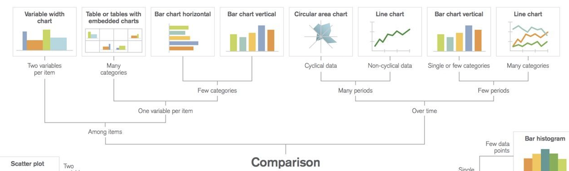
ケース別データの可視化パターンとpythonによる実装
データが与えられた時、まずは可視化してデータの特徴を把握することが大切です。しかし、何を軸にしてどのように可視化するのかということに関しては、あまりルール化されていないのが現状だと思います。
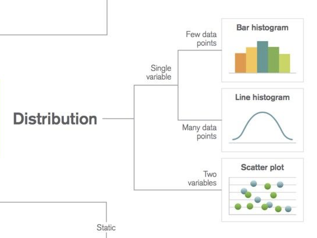
データから何を知りたいのか?ということから、パターン別にどのように可視化したらいいのかということをチートシート形式で示し、さらにpythonでの可視化方法を順に紹介していきたいと思います。

上のチートシートを参考に、
- Distribution|分布
- Composition|構成
- Relationship|関係
- Comparison|比較
の4つの項目に分けて、どのようなデータパターンではどのように可視化するとわかりやすいか、pythonではどのように実装するのかを記していきます。
準備
import matplotlib.pyplot as plt
import pandas as pd
import numpy as np
import seaborn as sns

plt.style.use('ggplot')
plt.rcParams.update({'font.size':15})

%matplotlib inline
可視化には主に、matplotlib.pyplot、seabornを使います。seabornに馴染みのない方は、この記事を見るといいと思います。
Distribution|分布
1変数の分布
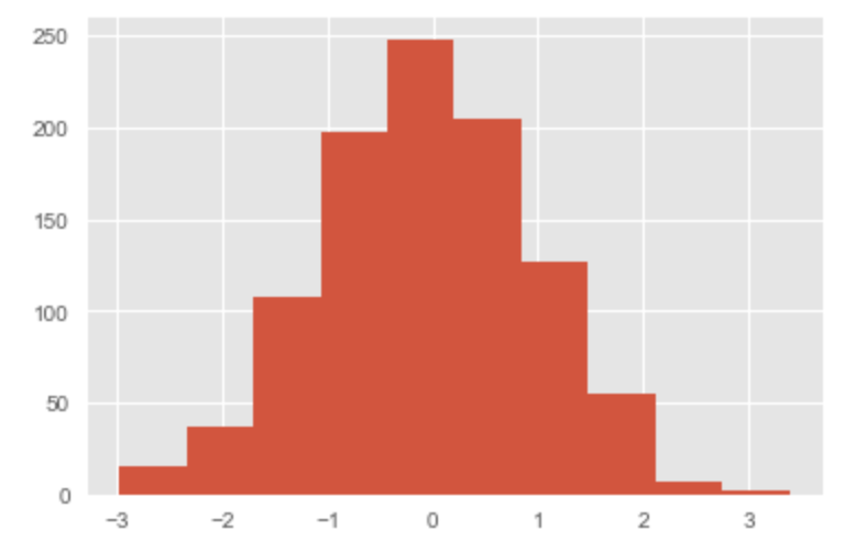
データポイントが数個の場合|ヒストグラム
x = np.random.normal(size = 1000)

plt.hist(x)
plt.show()
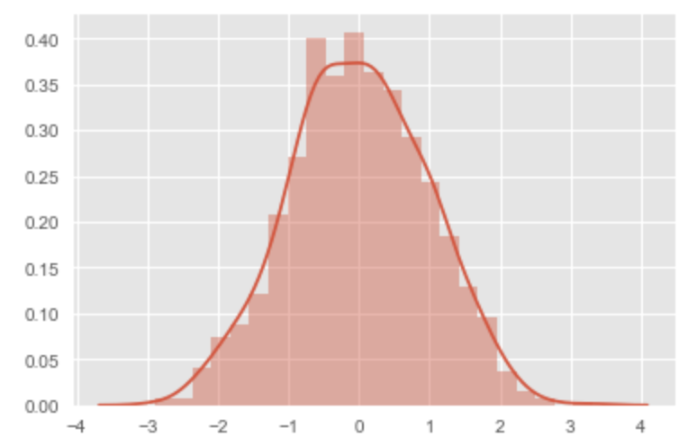
データポイントが多い場合|線グラフヒストグラム
x = np.random.normal(size = 1000)

# ここのみ、seabornを用いて可視化
sns.distplot(x)
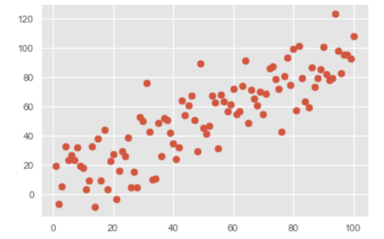
2変数の分布|散布図
x = range(1, 101)
y = np.random.randn(100)*15 + range(1, 101)

plt.scatter(x, y)
plt.show()
Composition|構成

時間ごとの構成
時間軸が複数個の場合
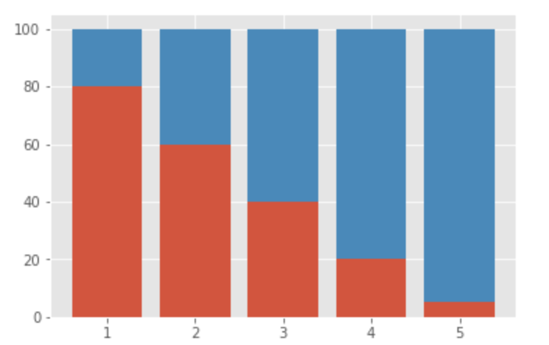
割合のみを見たい場合|累積棒グラフ
x = [1, 2, 3, 4, 5]
y1 = [80, 60, 40, 20, 5]
y2 = [20, 40, 60, 80, 95]

plt.bar(x, y1)
plt.bar(x, y2, bottom=y1)
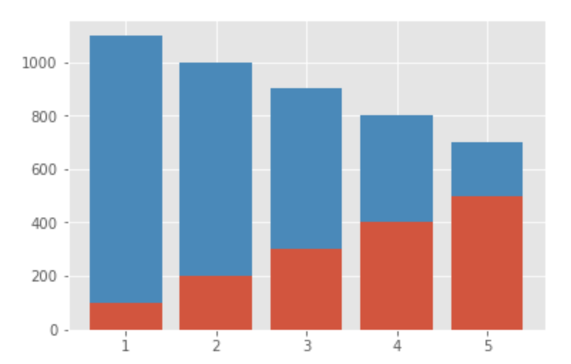
割合と値を両方見たい場合|棒グラフ
x = [1, 2, 3, 4, 5]
y1 = [100, 200, 300, 400, 500]
y2 = [1000, 800, 600, 400, 200]

plt.bar(x, y1)
plt.bar(x, y2, bottom=y1)
時間軸が多い場合
割合のみを見たい場合|累積エリアチャート
x = range(1, 7)
y1 = [0, 20, 40, 30, 40, 100]
y2 = [40, 50, 20, 40, 55, 0]
y3 = [60, 30, 40, 30, 5, 0]

plt.stackplot(x, y1, y2, y3)
plt.show()

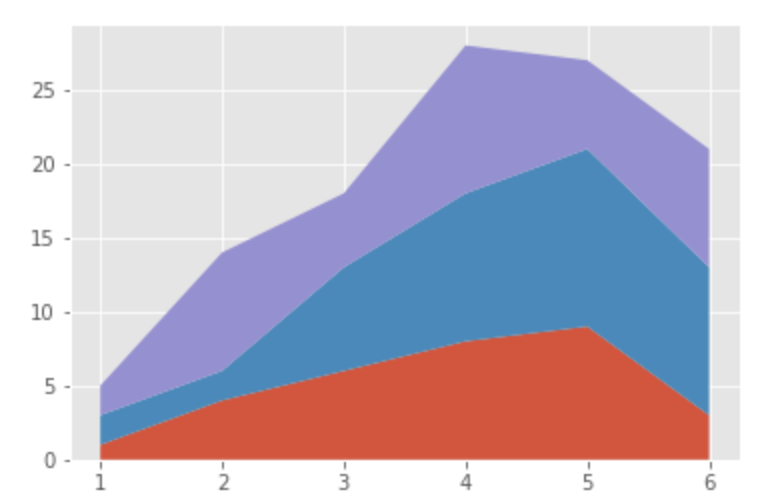
割合と値自体を両方見たい場合|エリアチャート
x=range(1, 7)
y1=[1, 4, 6, 8, 9, 3]
y2=[2, 2, 7, 10, 12, 10]
y3=[2, 8, 5, 10, 6, 8]

plt.stackplot(x,y1, y2, y3)
plt.show()
静的カテゴリごとの構成
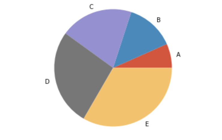
全体に占める割合を見たい場合|円グラフ
x = [100, 200, 300, 400, 500]
label = ["A", "B", "C", "D", "E"]

plt.pie(x, labels=label)
plt.axis('equal') # 出力が楕円形になるのを防ぐため
plt.show()
構成の構成を見たい場合|累積棒グラフ
x = [1, 2, 3, 4, 5]
y1 = [80, 60, 40, 20, 5]
y2 = [20, 40, 60, 80, 95]

plt.bar(x, y1)
plt.bar(x, y2, bottom=y1)

全体に対する累積値と値自体を見たい場合|ツリーマップ
import squarify

x = [13,22,35,5]
label = ["A", "B", "C", "D"]

squarify.plot(x, label=label)
plt.axis('off')
plt.show()

Relationship|関係
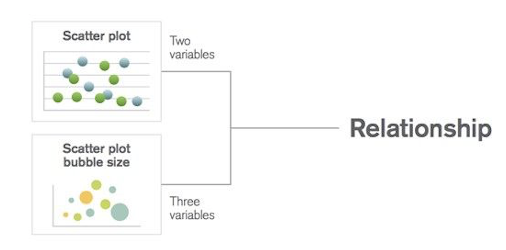
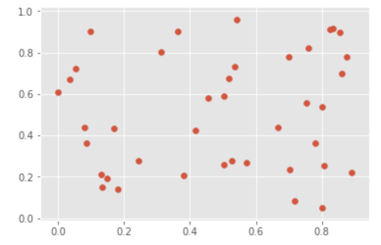
変数が2つの場合|散布図
x = range(1, 101)
y = np.random.randn(100)*15 + range(1, 101)

plt.scatter(x, y)
plt.show()
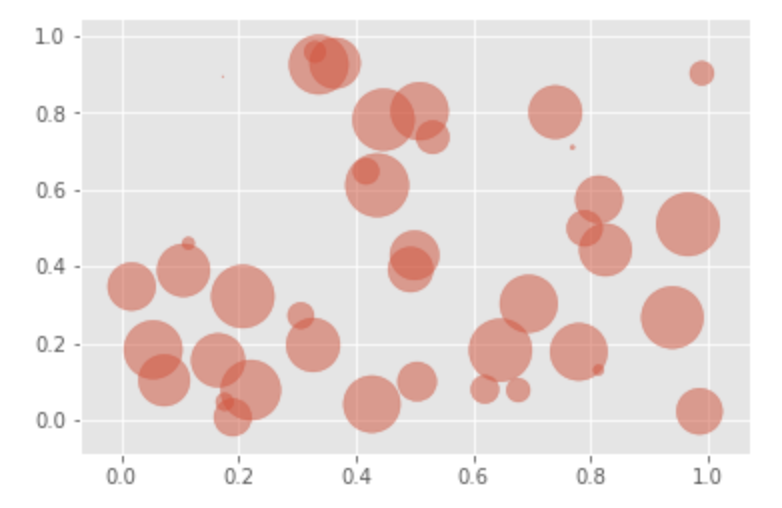
変数が3つの場合|散布図
x = np.random.rand(40)
y = np.random.rand(40)
z = np.random.rand(40)

plt.scatter(x, y, s=z*1000, alpha=0.5)
plt.show()
Comparison|比較
アイテム間の比較
アイテムごとの1変数を比較したい場合
カテゴリが少ない場合|縦棒グラフ・横棒グラフ
x = [1, 2, 3, 4, 5]
y = [80, 60, 40, 20, 5]

plt.bar(x, y)
plt.show()

x = [1, 2, 3, 4, 5]
y = [80, 60, 40, 20, 5]

plt.barh(x, y)
plt.show()

カテゴリが多い場合
iris = sns.load_dataset("iris")
sns.pairplot(iris, hue="species", size=2.5)

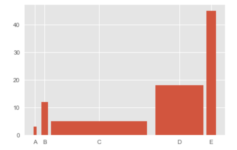
アイテムごとの2変数を比較したい場合|棒グラフ
y = [3, 12, 5, 18, 45]
x = ('A', 'B', 'C', 'D', 'E')
x_width = [0.1, 0.2, 3, 1.5, 0.3]
y_pos = [0, 0.3, 2, 4.5, 5.5]

plt.bar(y_pos, y, width=x_width)
plt.xticks(y_pos, x)
plt.show()
時間軸による比較
時間軸が少ない場合
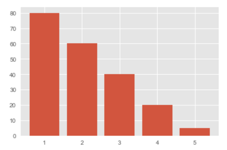
カテゴリが1つもしくは数個の場合|棒グラフ
x = [1, 2, 3, 4, 5]
y = [80, 60, 40, 20, 5]

plt.bar(x, y)
plt.show()
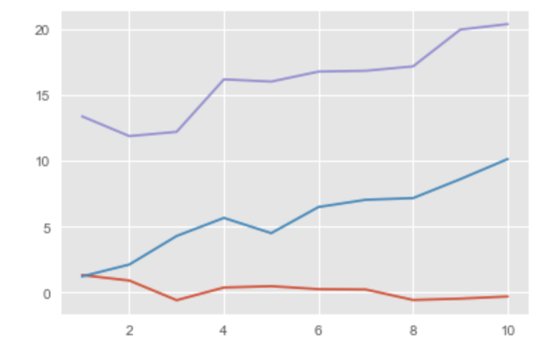
カテゴリが多い場合|線グラフ
x = range(1,11)
y1 = np.random.randn(10)
y2 = np.random.randn(10)+range(1,11)
y3 =  np.random.randn(10)+range(11,21)

plt.plot(x, y1)
plt.plot(x, y2)
plt.plot(x, y3)
plt.show()
時間軸が多い場合
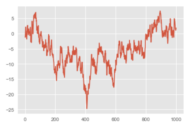
非循環データの場合|線グラフ
y = np.cumsum(np.random.randn(1000,1))

plt.plot(y)